Color Palette
Proper use of color helps to create a visual consistency throughout the University’s communications both internally and externally. Color is a dominant driver of emotion, and it is important to apply Manchester’s color palette accurately.
Primary
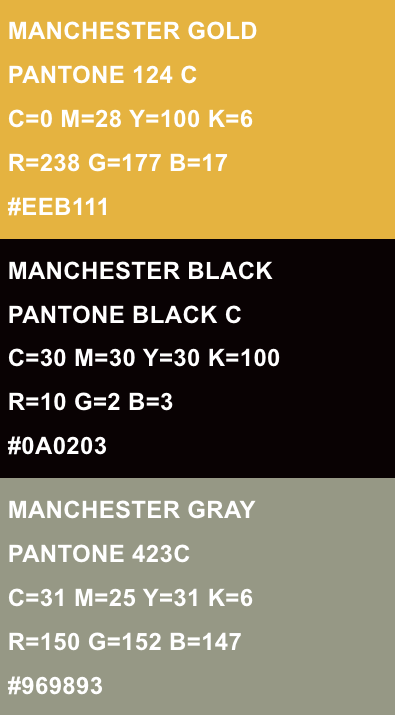
Manchester gold, black, and gray are our primary brand colors. They should be the predominant colors used in University communications, at about a 3:1 ratio versus the accent color palette.


Accent
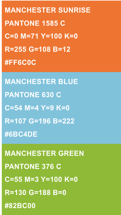
Our secondary color palette adds brightness and vitality to the Manchester identity, and represents the energy of the University. These colors should be used in minority ratio against the primary colors on a canvas. Use a 3:1 ratio as a general rule.


White
It’s important to remember that white, or the paper color, is an important part of our color palette. White space is an essential component of a healthy design, and should be considered a brand color in conjunction with this palette, and used liberally.


